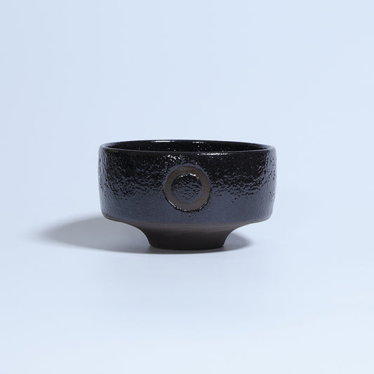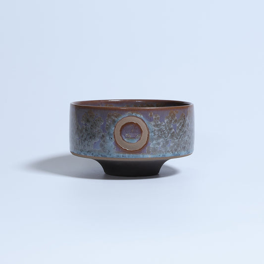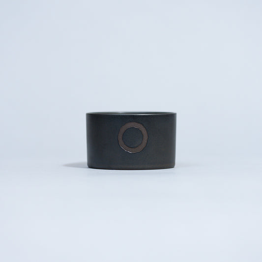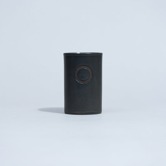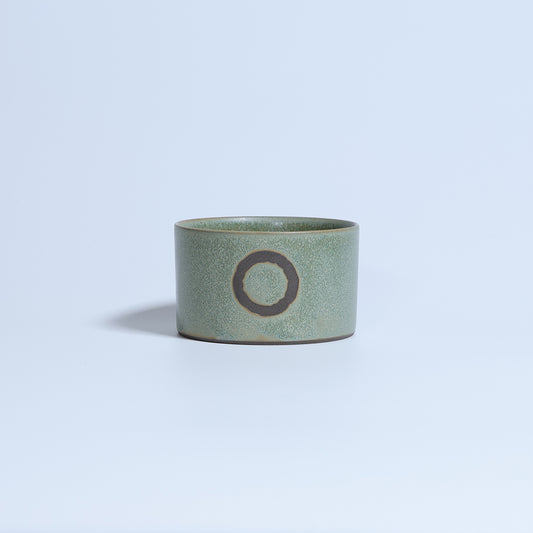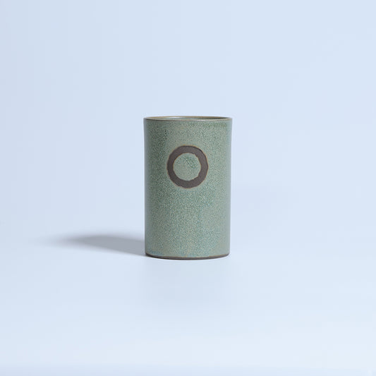

Things become bookmarks of emotions.
A name is a compass of consciousness.
We believe that naming is the act of giving a worldview to the object itself.
A cool impression, a fluffy impression, a tasteful impression, or a humorous impression that will make you laugh...
There are so many different ways in which a name can convey images.
Having that name can make people who use it more positive and have a small impact on their lives.
If it worked that way, I'd call it a naming success.
At QUTOTEN., we are very particular about brand names and product names.
Actually, I would like to ignore this kind of story without explaining it in detail, but since we live in a world where it will be buried if we don't properly communicate it, I thought I would write down this dilemma in the form of an essay.
I would be happy if you could read this as if it were just a casual chat over a glass of whiskey.
*Don't worry, as the story gradually becomes more informal towards the end. lol
The first name was "QUTOTEN."
The first name we came up with was the brand name "QUTOTEN."
It means "." and "," which every Japanese person knows.
Punctuation marks make sentences easier to read and add rhythm.
Expanding this further, punctuation marks can be seen as playing a role in creating "white space."
We live in an age of information overload, which is inseparable from the Internet.
I feel like many people are forced to live lives with little margin.
We are busy with tasks, endlessly scrolling through social media while worrying about notifications, and advertisements everywhere stimulate the desire to make purchases.
The gambling spirit that arises from comparing oneself with others stirs up desires from all directions, making it difficult to satisfy one's heart.
Putting a punctuation mark on such a busy life.
I want you to forget about the hustle and bustle of the world and have a peaceful time while interacting with QUTOTEN. products.
Things like, ``This tea is delicious,'' or ``Maybe I should try repotting it soon.''
That kind of affluence is not easily reflected in GDP or economic indicators. lol
I believe that the Japanese people's sensitivity to happiness is in an area that is difficult to quantify.
Unlike the Western concepts of "victory" and "domination," it is not always something that can be measured quantitatively.
Many foreigners who travel to Japan probably come to experience Japanese philosophy and spirituality.
Zen and tea ceremony are easy-to-understand examples.
Now, I'm off topic, but creating this kind of "white space" is the deepest root of our brand.
In the world that comes after materialism, I feel that these Japanese aesthetics and ideas will attract even more attention than they currently do, and I want to share them with the world.
This feeling is reflected in the name "QUTOTEN."
About the font of “QUTOTEN.”
Here's a side note about the "jizura" of the name.
It's a very minor detail, so you may be able to skip it. lol
If you express "Kutoten" as it is in the alphabet,
KUTOUTEN
KUTOTEN
That's right.
However, the actual brand name is
QUTOTEN.
It becomes.
The reason why this K has been changed to Q is not just for differentiation.
There's a good reason.
Oh my God!
“.” and “,” are hidden in the letter QYes! !
...Yes, that's it. lol
Doesn't this feel good?
I usually work in design and branding, so finding meaning in small things like this has become an occupational disease. .
- Why does the Olympic logo have those five colors?
- Is there a hidden character in Kirin Beer's Kirin?
- What does the arrow in the Amazon logo mean?
- Is there a hidden picture in the FedEx logo?
- The sense of fun contained in the label of Yamazaki Whiskey
- etc.
There are endless stories behind the design.
When I myself design logos and other creatives, I always include that kind of trick or playfulness somewhere.
In this age of AI, I want to cherish this kind of human-like commitment.
(If you do too much, you may get scolded...lol)
Another thing that is often overlooked is the "." (period) at the end of the brand name.
It is true that when we receive requests for collaborations or work, there is a high probability that the “.” is omitted….LOL
To be honest, I don't think it can be helped if people don't notice that much, and don't worry that they won't take it negatively just because you're not aware of it.
However, I am even more impressed by those who properly add ".". lol
The purpose of adding a ``.'' is because of the connotation of a ``period'' (a full stop in English) and the purpose of creating a subtle blank space in the text to make the brand name stand out just a little.
Example:
- QUTOTEN is a Japanese craft brand.
- QUTOTEN. is a Japanese craft brand.
What do you think?
Doesn't your impression change just a little bit?
It's a small difference, but I cherish this subtle sense of discomfort.
As the saying goes, ``God dwells in the details,'' I believe that obsession has a fractal structure, where the parts and the whole are self-similar.
In other words, if you neglect one part, the overall impression will look shabby.
Just as top-class restaurants pay particular attention to the dishes and the in-house BGM, we want to improve the quality of our manufacturing by using the highest number of pixels we can find.
In conclusion
This time, we talked about the origin of the brand name "QUTOTEN." and the thoughts behind it.
If I have the opportunity someday, I would like to tell you about the origins of other product names and the secret behind their naming.
The products we name are like our own children.
This is a "parent's" story, so to speak, so I hope you'll take it lightly. lol
Thank you for taking your valuable time to read this far.
So, I hope that you can create a comfortable space in your life.
。、